White Kitchen Makeover–ORC FINAL REVEAL
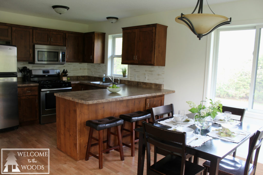
Last month I shared my living room makeover where you saw I removed all the red from my design and went with a more neutral, modern aesthetic. This picture I didn’t include in that room tour because it contained a secret…I also painted in the dining room and kitchen! Check out my white kitchen makeover.
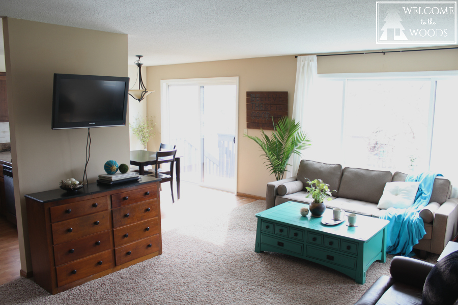
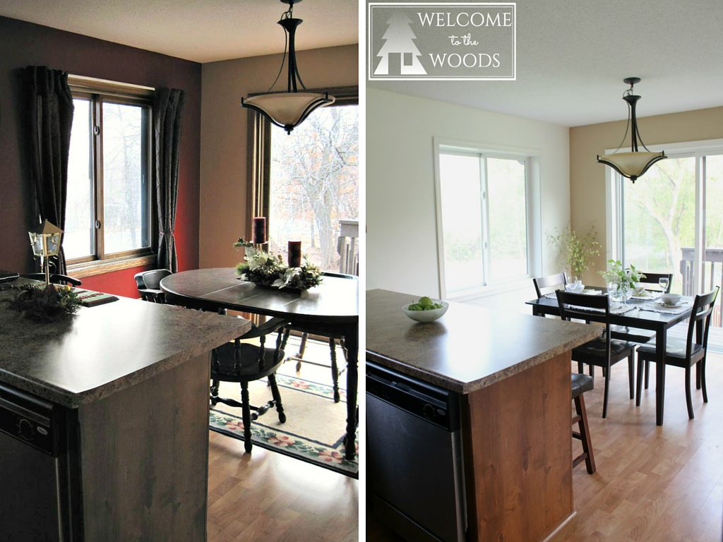
This is what it used to look like with the red.
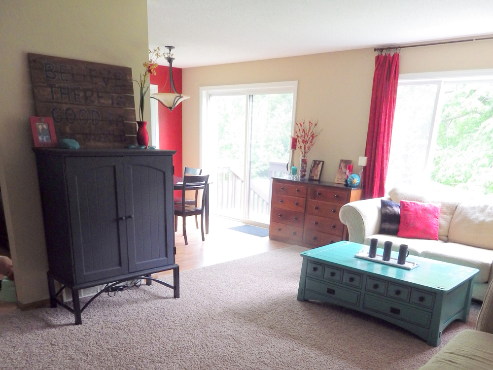
If you’ve followed along the last six weeks, you’ve seen how I tackled each piece of this transformation for Calling it Home’s One Room Challenge. Here’s my to-do list with links to the posts for more info.
Paint wallsPaint baseboard trim whitePlace interesting decor in dining room cornerPaint light switch & outlet covers white- Purchase curtains for dining room window
- Paint fabric curtains with a modern design
As you can see, I unfortunately didn’t get the curtains done like I wanted. This is because I wanted to buy ceiling to floor length curtains and they are cheapest at IKEA. Unfortunately, the nearest IKEA to me is a 1.5 hour drive and I haven’t found time to accomplish that since my son Theo was born the end of April.
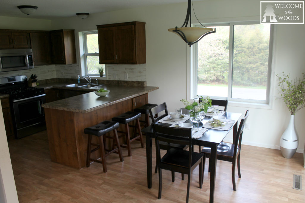
Here’s the picture of the kitchen with all the new WHITE. Sure, there’s a lot less color in my house, but I actually find that soothing. Although I love red in the kitchen, the white makes everything so bright.
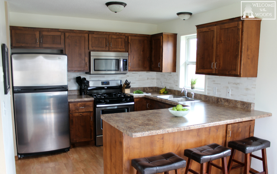
After painting the faux marble tile back splash last spring, the red walls started to bother me. I felt like they clashed with the white back splash I had worked very hard on.
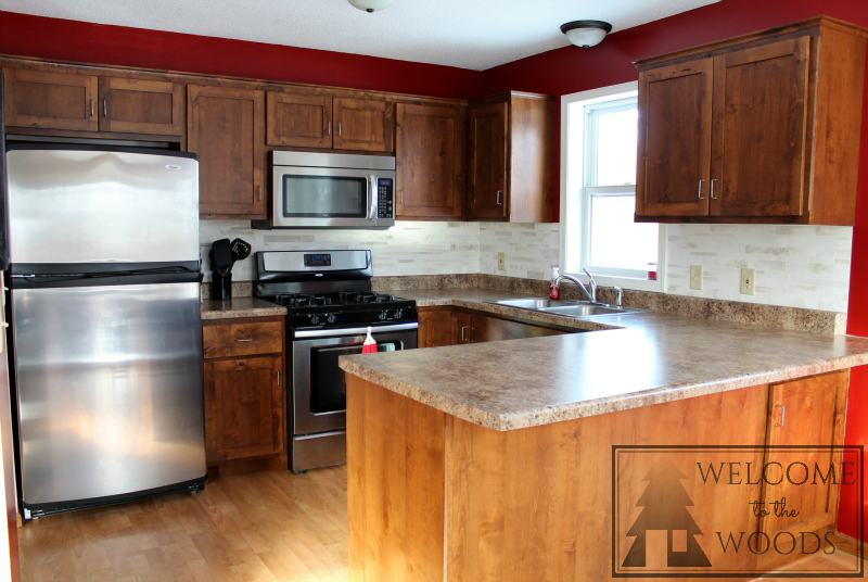
It’s kind of that old trap of home DIY: when you improve something, it highlights the other things around it that also need improving. It’s a never ending cycle, like the whole saga with my lamps.
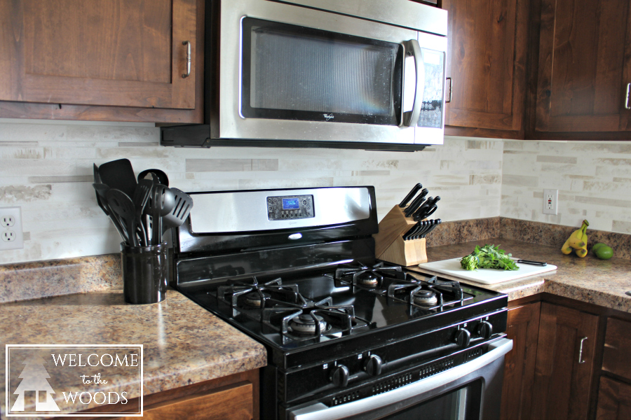
I also feel the white shows off my back splash more and makes it look more real because it’s a subtle transition from the walls instead of stark. Painting those outlets and light switch covers white sure helped the back splash to look better, too!
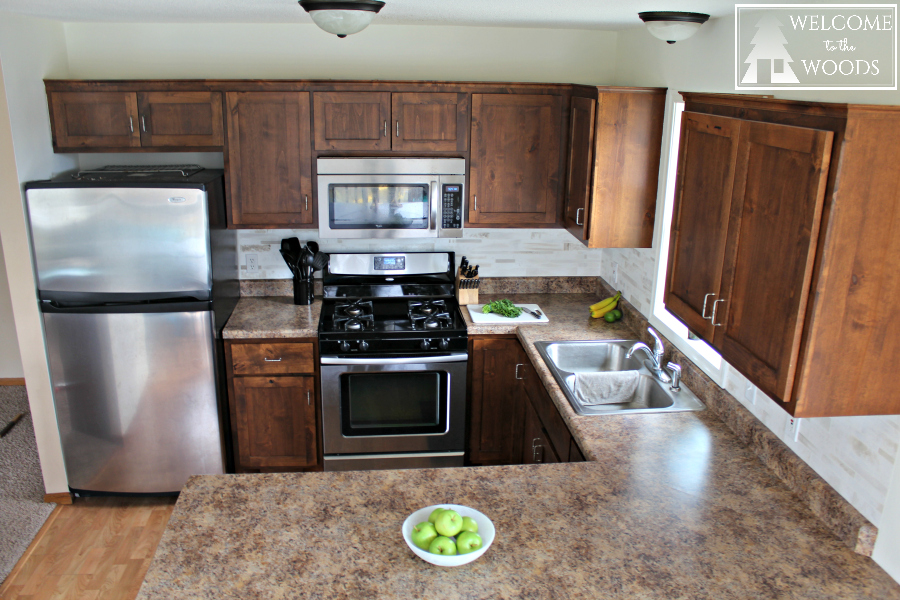
If you follow my blog, you know I painted my kitchen walls when I was hugely pregnant. Let me tell you, it was not easy climbing on those counters with a big belly. BUT I’m happy to say I didn’t get hurt. I proved my husband wrong this time (he always says it’s just not a project unless I injure myself).
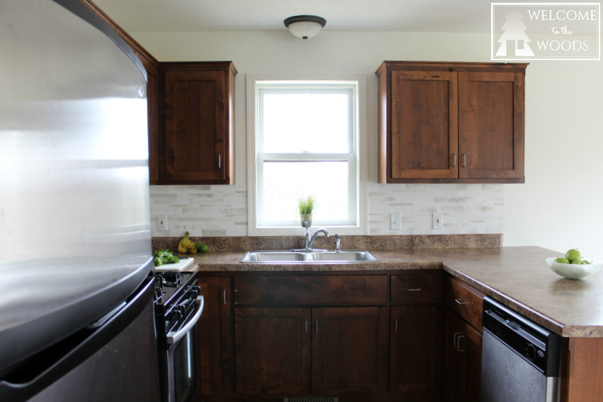
My favorite thing about the white is how it bounces light off the walls. It is very bright in my kitchen compared to before and our one little window looks much happier. Totally worth the four coats of paint it took to cover glossy red.
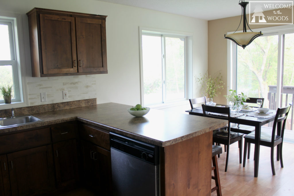
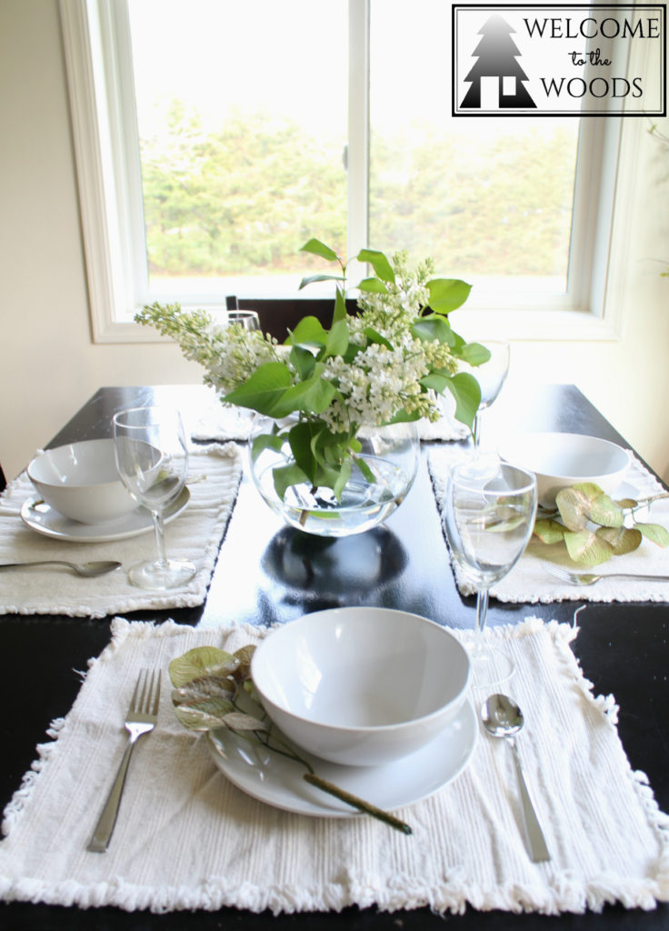
My dining room sure looks different with white walls and trim from when we initially moved in four years ago!
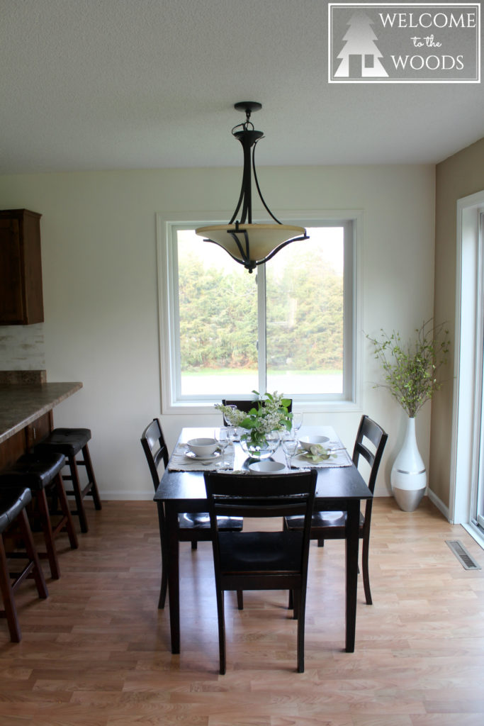
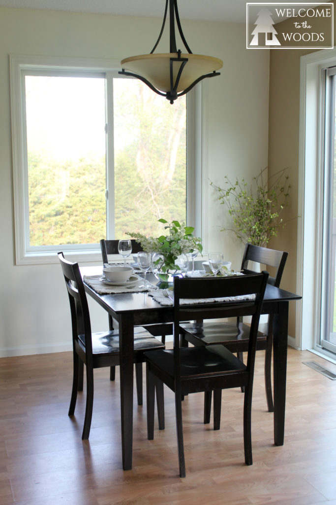
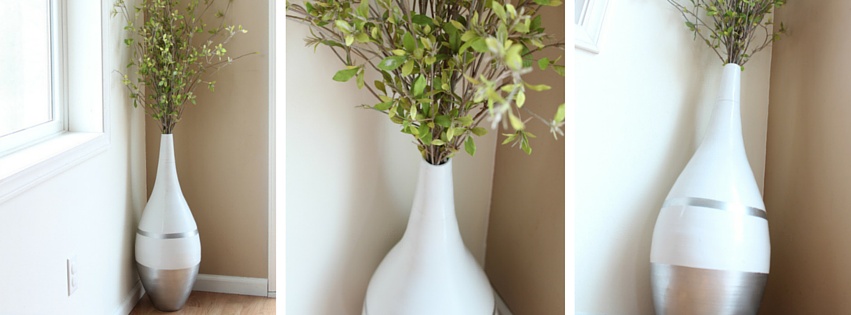
The corner decor for the dining room turned out so great.
My tablescape boasts a fresh lilac centerpiece from my garden.

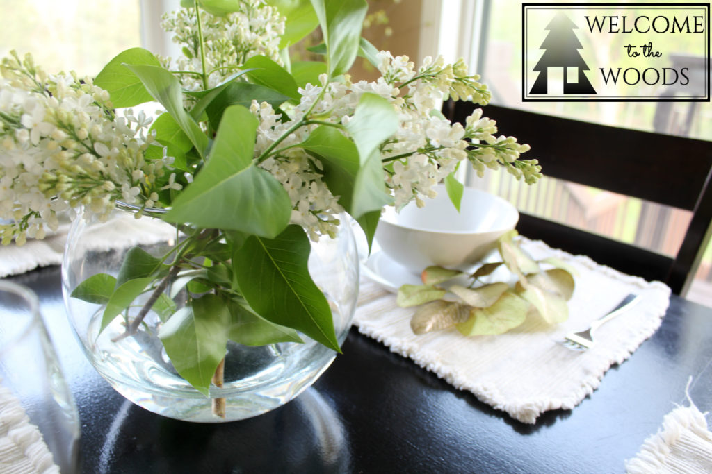
Besides the dining room, I also gave my kitchen some touches of green for summer.

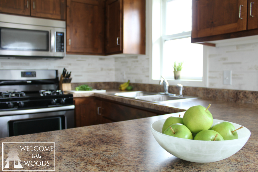
I am really enjoying cooking in here after my bright white kitchen makeover.
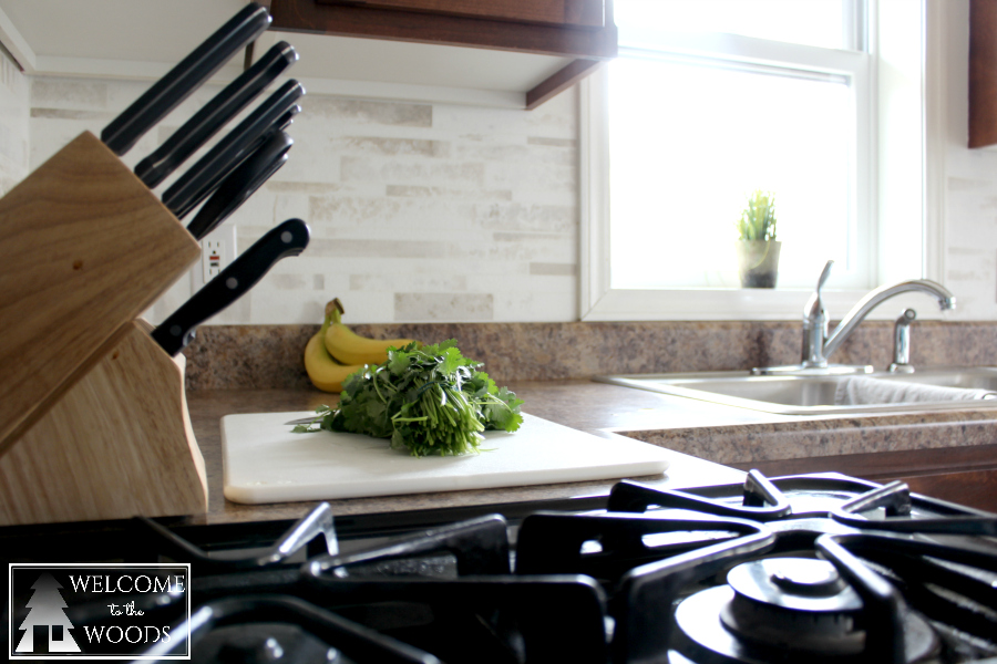
Thank you for visiting to check out this white kitchen makeover! Be sure to read about my recent living room makeover, too!
Let me know your thoughts in the comments! Do you think I made the right choice to ditch the red? Would you have picked the back splash or the red walls as the design choice to keep? Do you think the dining room looks too cold without curtains?

Visit my other posts about my white kitchen makeover and be sure to go to the hashtag #oneroomchallenge to see other blogger’s rooms!
It looks great! I always find your tutorials helpful, I am still putting off painting my trim. Thanks for sharing your tips 🙂
Thank you Ashley!
I love it!! I think white looks great!
Thanks Lisa!
I think I might consider painting the top cabinets white and the base cabinets black and the legs on the stools white. I think it would make your kitchen look larger and like a part of the room.
I like your idea, and if our cabinets were an ugly stain color I would. Perhaps I will paint the legs of my bar stools, I hadn’t thought of doing that before. Thank you for commenting!
It’s crazy how lighting up one wall can change the entire room eh?! We recently painted a dark gray wall all white and it feels like we tripled our space! Looks great!
Yes! It is crazy! Thanks for stopping by and commenting!
I like the white so much! brighter and more cheerful!
Thank you so much!
It came out great!! Such simple changes that make a big difference 🙂 I love how light and airy it is now.
Thanks Kathleen! I definitely believe in the power of paint.
This is a great example how a whole new color school can totally MAKE the room! Congrats and CHEERS to us for another room done!
Thank you!!
Your kitchen is much better in white than in red.
For the dining room, I would suggest draping some sheer white fabric across only the tops of the windows…adding just one more thing that is soft and curvy to balance all the hard edges. And maybe repeat that across the top of the kitchen window.
Thank you Peggy. Sheers are a great idea and I hadn’t thought of that. Something to consider!
Wow Melissa! You did a great job. Adding the neutrals has made a quite a drastic change to the space – it looks absolutely fab!
Thank you Sam!
I love what you’ve done in here- it looks so bright and fresh! I think it looks perfect as it is! If you did end up wanting to add something to the windows (if the light is too intense at some point in the day like here in CO) maybe natural woven blinds? They might look great with all your other organic touches. Love all that natural beauty right outside your windows too! Wish we had trees!
Thank you for the input! I like the idea of blinds instead. I do appreciate the trees outside! We live in a beautiful area.
Please add curtain and/or roman shades in kitchen and dinning room with subtle print and textures. Add more texture with baskets or pottery above cabinets, and art work in dining room. Use warmer colors such as ivories, creams and tan to bridge gap between wall color and dark cabinet color
Wow, great ideas! Thanks for commenting! I have considered adding curtains in the dining room and want to, but my kids are such messy eaters that having textiles in there with three under the age of 6 would be disastrous! In the future, I will have curtains! 🙂
Melissa
I so love the lighter walls and the freshness it’s added. I’m not a big fan of totally naked windows, so I agree with adding a finishing touch to the tops, like matching valances or cornices in both rooms, the same height as the cabinets and deep and long enough to cover any hardware you may add later (like curtain rods or privacy blinds). This way you’d have a finished look but out of reach of the little ones. Great job with all you’ve done!
Thank you!
Love the kitchen makeover! I wasn’t sure I’d like the “tile backsplash,” but I must admit, you might have changed my mind!
Thank you!
I’m thinking about trying this and I’m a lot older than you are. There used to be a textured stuff that we could put on projects to make things looks like rock or snow, or whatever,and I’m wondering if that would work in this case as well. I might do a trial board and see how it turns out. Because I love the look that you did here and the only time that you can tell it’s not real tile is when you end on the sides. So it would work out great if the tile ended next to cabinets or appliances all over and I don’t think anyone would ever suspect that they are not real. They really are gorgeous!
Looking at your older posts I saw this today. Two years old, almost, but still very informative.
I love how the white brightened up your kitchen, the red seemed to box it in. I love my undraped windows in my dining room, it lets the light and beauty of nature shine through.
Thank you for sharing your ideas and talent with all us DIY people. Love all you do!
The white is so beautiful…..upgraded your kitchen for sure. You have a lot of
ingenuity and courage. I had 5 small children so I think a rug can wait. Or…
maybe you could find a rug that is washable? Those kids will grow up so fast
You won’t think it mattered so much.
Thank you for sharing your kitchen project. For more than 8 years I have vacillated “to paint or not to paint” the kitchen. I like my kitchen–I just don’t “love it”. Your before and after pictures have made up my mind—I’m going white! Even putting in a splash.
Thanks again. I will be sure to take before and after pictures like you did to perhaps help someone else make up his or her mind!
Wow I am so glad I can be an inspiration to you. Painting it white has been really great! I would suggest choosing a semi-gloss finish so it’s easier to wipe down and more durable to stains/spills. I think you are going to love how it brightens up the room! If you want to share before and after pictures, please do so in the Welcome to the Woods Facebook group: https://www.facebook.com/groups/135624800568114/
Can’t wait to hear how your painting project goes!
Melissa
I am recently redoing my kitchen. I love that backslash. Can you tell me the brand, name of tile, and where you got it please…
Ha that’s so funny, I actually painted that backsplash by hand. Here’s a post on how I did it…I’m sorry it can’t be replicated. https://www.welcome-to-the-woods.com/faux-tile-back-splash-with-paint/