Living Room Update – New Furniture!
Remember in the spring when I shared my living room makeover? Well, it’s time for another living room update, because I changed things…again. If you don’t remember, this is what my living room looked like when I shared it with you last.
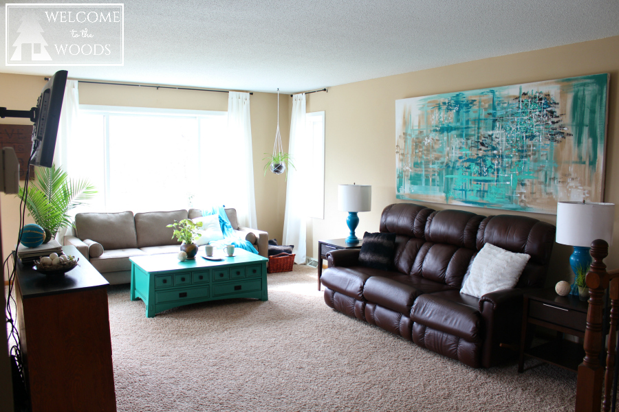
We had gotten new sofas, one of them being hideous and extremely comfortable for my husband and the other being stylish and simplistic for me. Can you guess which was which?

I tried hanging a HUGE piece of abstract wall art above it to make it look more modern and aesthetically pleasing. We lived with this sofa for about six weeks and then one night my husband came to me for a confession. If he had a tail, it would’ve been between his legs. He said, “Honey you know that reclining La-Z-Boy sofa I insisted on getting? Well, it’s not as comfortable as I thought it would be and to be honest, I don’t really like it.”
Within a week, I had it sold. I was so happy to be rid of that thing!
[the_ad_group id=”8″]
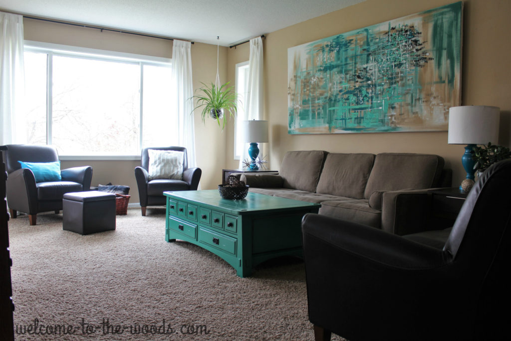
The only thing I liked about the sofa was the leather material juxtaposed with the other textures in the room. To replace the ugly brown monster, I got a set of two club chairs and a small sofa that fit with the modern style I was aiming for. Now our living room looks like this.
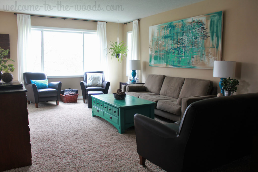
Very similar, but oh so much better.
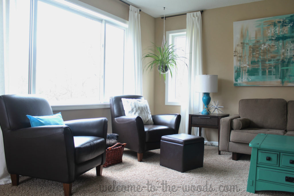
The new club chairs set up a perfect conversation area. And that ottoman actually didn’t come with the set, I found it for $1 at a garage sale! Score!
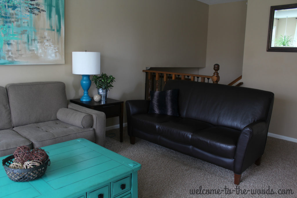
On the other side of the room, the matching sofa provides so much more seating than we’ve ever had. Our living room is the largest room in our home and we entertain often, I’m so grateful to now have 8 seats in this space.
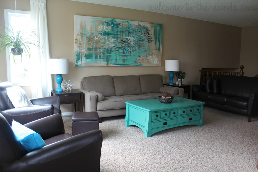
This room still has a few things I’d like to update. I have plans for the stair baluster behind the leather couch. Stay tuned to see how that all turns out. Plus, I’m still not completely happy with our never-ending TV stand saga since my barn window table broke. Another living room update to come I guess.

Nevertheless, it feels good to have furniture I LOVE and a cohesive look to the most important space in our home.
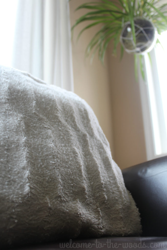
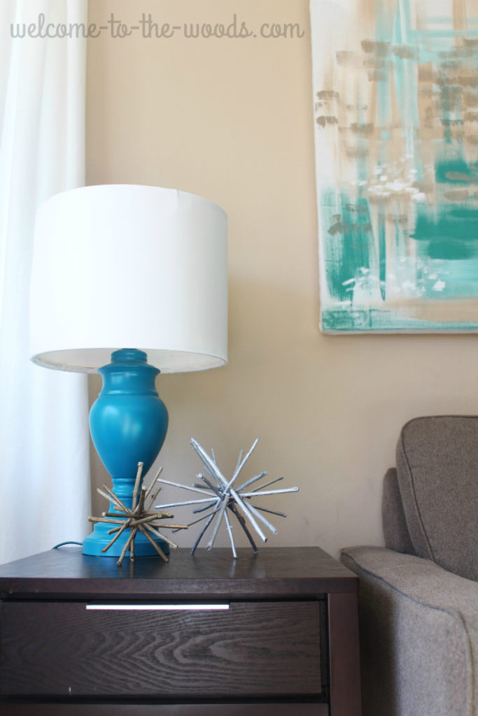
The space still has a lot of different textures to add interest in the design and certainly some bold color.
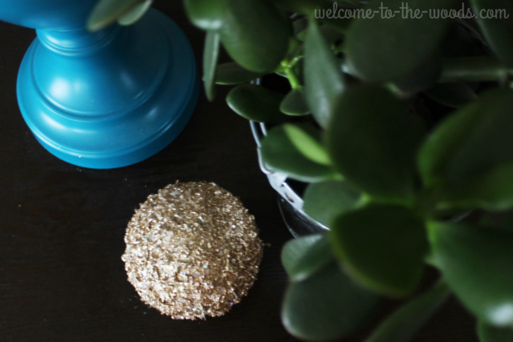
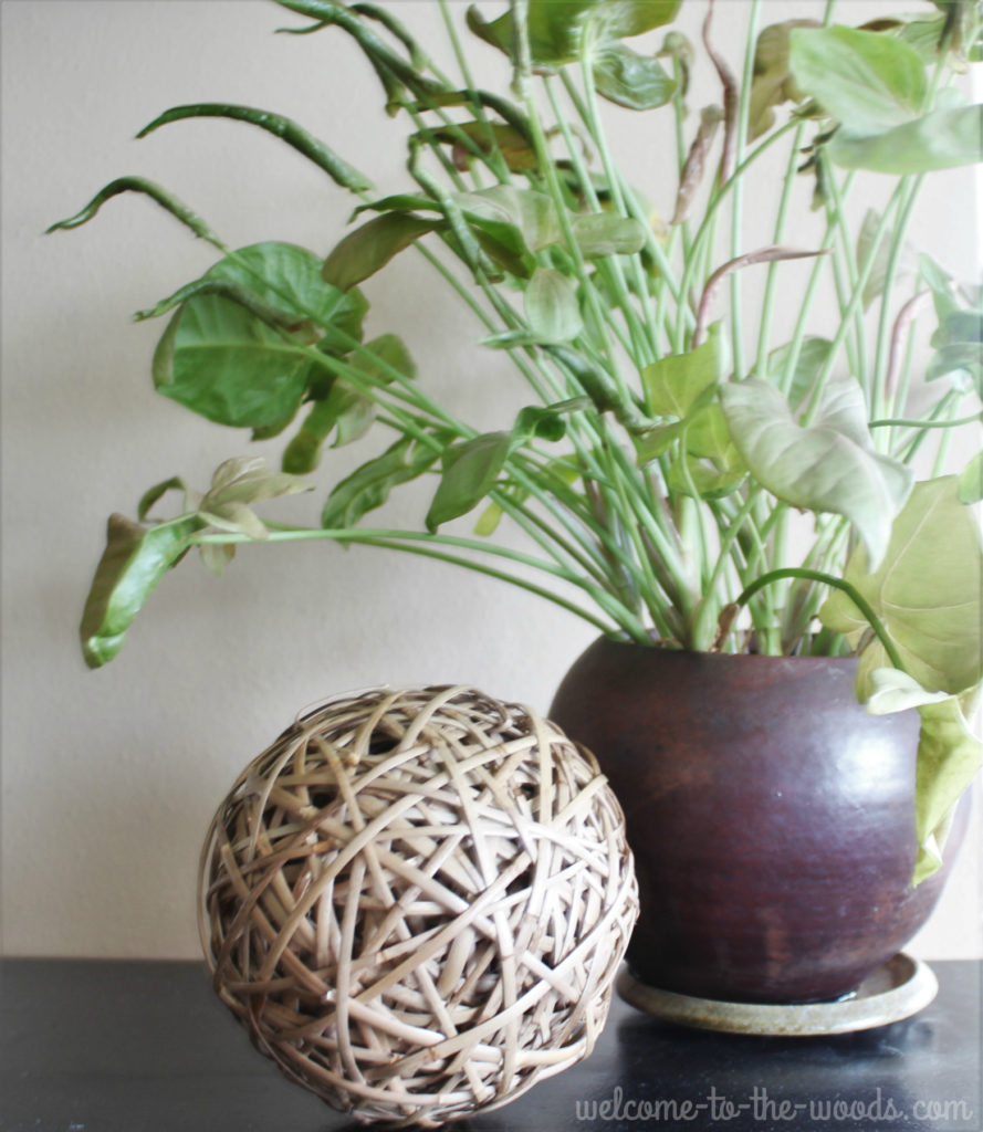
I still enjoy having the plants in my home (I haven’t killed them all…yet).
If you ask my husband how he’s coping with the constantly changing living room, he’ll probably do this:
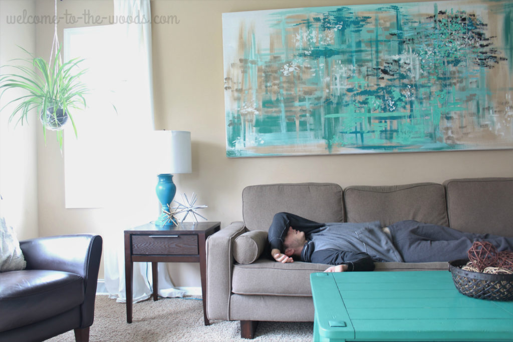
But really, that couch is the best place for a nap.
Thanks for reading my living room update! If you like what you see and you want to read more, check out these projects featured in this living room.
Teal coffee table
DIY lamps
Abstract wall art
Hanging macrame planter

Its very nice, but to me the space screams for something to break up all that biege carpet. Like a big area rug if you can find one that’s not too overpowering. A couple of years ago I was given a coffee table similar to yours and three different end tables. I stripped them down and redid them in in that tourqoise and it goes well with the western theme we have.
That is an idea I’ve thought a lot about. I haven’t been able to find an area rug large enough to get the feet of my furniture all touching the rug. Without grounding the furniture on the rug I think it would look silly. An 8 by 10 rug is not big enough to center and fill the space. I have been at a loss for what to do, but I appreciate your suggestion. Do you have a good idea on how I could use multiple smaller rugs to break up the space so that it wouldn’t look silly?
Melissa