How to Create Flow in Home Design
Have you ever walked into a home that you thought was well decorated, designed cohesively, and really flowed, but you couldn’t quite put your finger on why? It’s hard to figure out why one house looks well decorated, but the next house with similar items and similar style, does not. How does one create a cohesive interior home design? How do you get your home to feel well designed throughout, and get each room to speak to each other? I’ll tell you one simple tool to achieve this effect: color.
In the Midwest, it seems most people are plagued with a fear of color. Around here, it seems gray is an adventurous choice compared to the usual beige, tan, and brown. I don’t think this is because people actually like these colors best. I also don’t think it’s because people chose them for their guests (the way staging your home suggests you paint in a neutral color palette). They don’t think, “I want to paint this room beige because when people walk into my house, they might not like the color, but they definitely won’t dislike the color.” I think the reason Midwestern folks choose shades of brown and gray and other neutrals is because they are afraid colors will clash. A color might look bad once it’s on the wall, it might clash with the paint color in the next room, or it might look out of place. These fears should be put away in favor of a more interesting and expressive home design that truly reflects the homeowner’s style. Here’s how you can create flow in home design!
Pick a Color Family
There are more paint colors than colors in the rainbow (is that possible!?) and it can be overwhelming trying to chose. The first thing you do is pick a color “family.” Remember when we learned about tints, tones, and shades when mixing your own paint color? Each type of hue is a family (I call it a family, I don’t think there’s a real term for it).So tints are colors that have a white base and would be considered pastels.
Tones are colors that have a gray base and are more subdued.
Shades are colors that have a black base and would be considered bold.
Tones are colors that have a gray base and are more subdued.
Shades are colors that have a black base and would be considered bold.
My house has a bold color family. Each paint color in my house has a bold color painted on the walls or bold accessories for furnishings, painting one room in a pastel would make that room clash.
Click on the picture to be taken to my house tour and the breakdown of costs for all the furnishings in my home.
For instance, you might notice the only room that sort of sticks out is the master bedroom. This is why I had to repaint this room after the first paint color went on. The first paint color was slightly too pastel, and I repainted to be a truer gray. It still looked a little pastel to me, so I added in black accents to pull the bold shade out of the color. But if I’m going to be honest, my design sense tells me this room is not quite cohesive with the rest of my house. If it’s not pastel, it’s much too subdued and is probably more in the tone family than the shade family. Learn from my mistakes, people!
Pick a Color Scheme
Now let’s talk about color schemes. I don’t want to get too detailed, so I’ll just run through some common and easy to execute color schemes on the color wheel. Here’s a handy diagram:

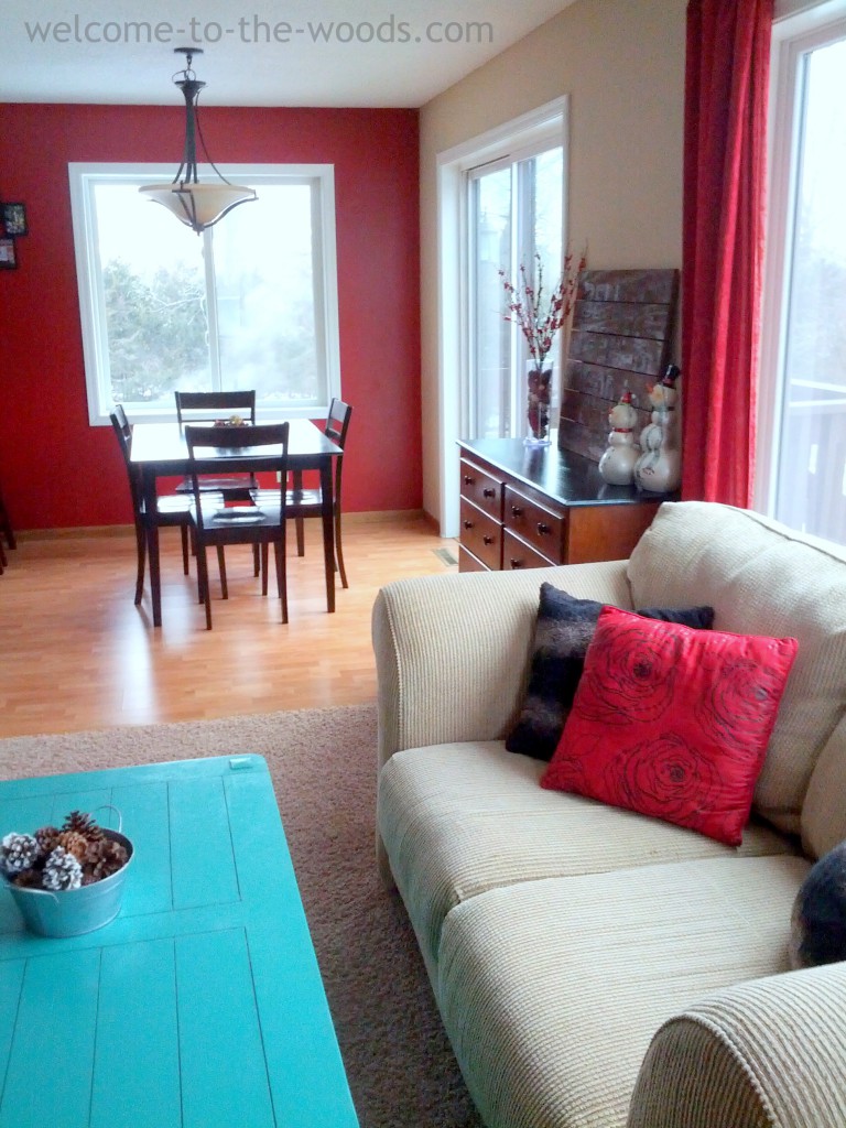
I’m especially drawn to designing with complementary and split complementary color schemes. When I chose a paint color for the walls, I accessorize with two neutrals and one complementary. Sometimes I go with two complementary colors and one neutral. It’s okay to fudge your complementary color (for instance, my living room is not red and green, it’s red and teal).

Here’s an example of a room decorated with a true complementary color scheme.

This is an example of a more intermediate color scheme.

Here’s an analogous color scheme.

If you’re decorating within a color scheme, your design will naturally please the eye and look cohesive.
Color Repetition Creates Flow
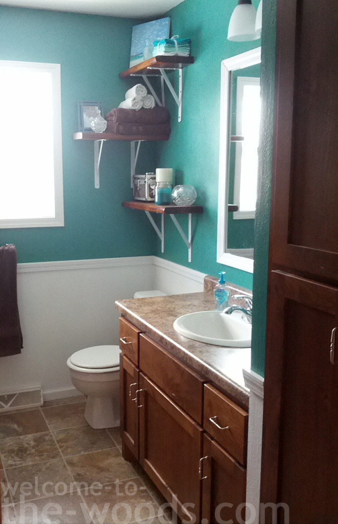
Now that you have a color family and a color scheme, you need to repeat these colors throughout the house. Each room’s color should carry into any adjacent room. This will create flow in your house and a very cohesive design. That teal accent color in my living room is the star color of the adjoining bathroom.


The same turquoise paint I painted my coffee table in the living room went on the walls in the bathroom.
The red wall color in my kitchen is repeated in the living room with accent pillows and curtains.

Here’s a home that picked one color and repeated it throughout the whole house in various ways (apparently teal is the color of choice).

Here’s a home demonstrating the repetition of yellow.

So any color you chose, be sure to decorate each room it is near with that color as well.
This is how you use color to create flow and cohesion in your home’s interior design. Let me know if you learned anything! Or better yet, share with me some photos of your home’s use of color. Thanks for reading!
